The Single-Column ATS Resume Template (2026)
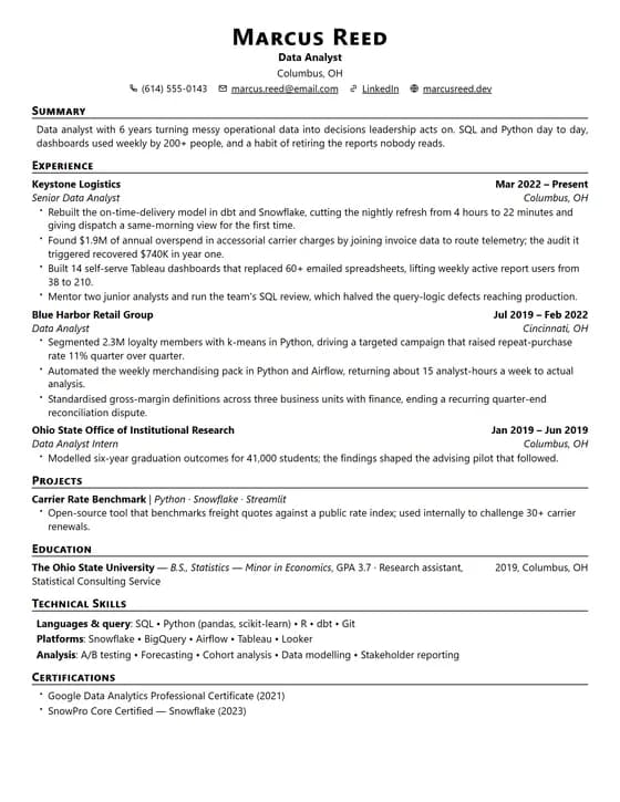
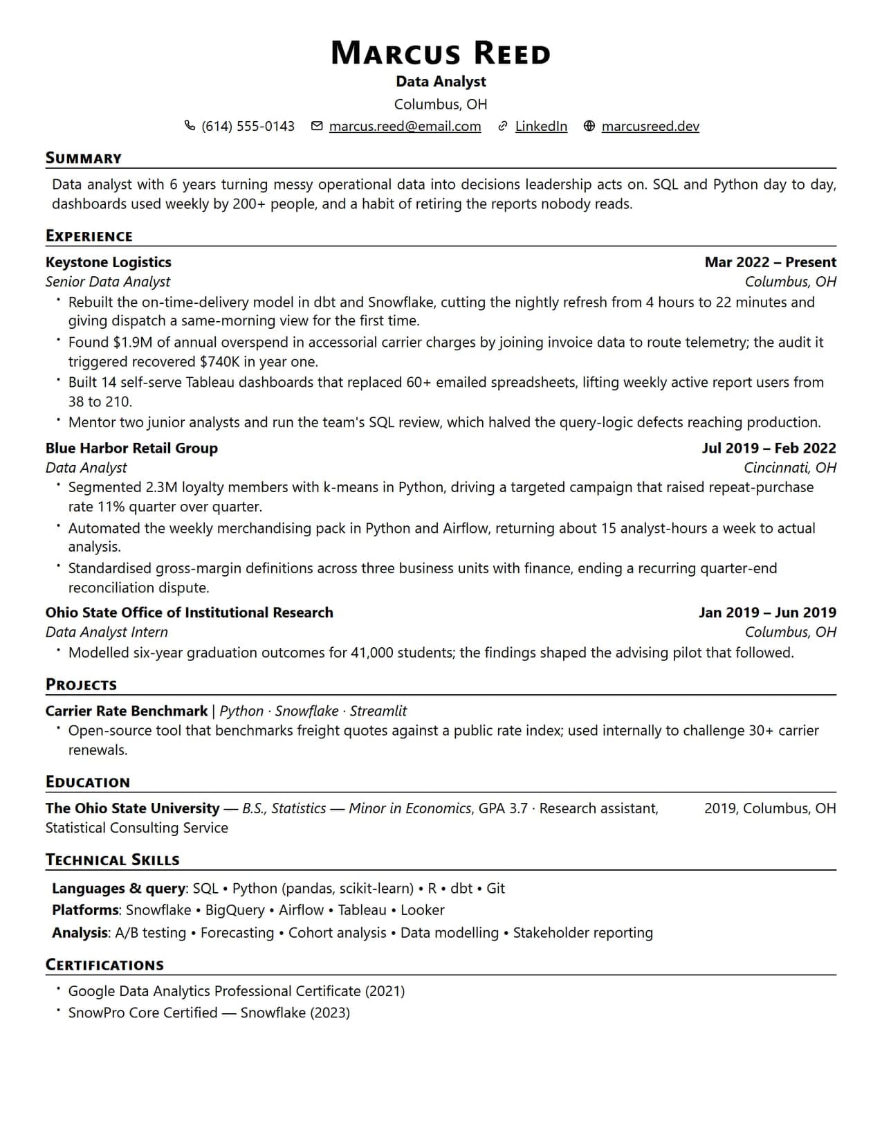
This is the layout to use when you are not sure which one to use. It is a web port of the LaTeX resume that engineers, students and academics have been passing around for a decade, and it is deliberately plain.
It works because it does the dull things right: one column, standard section headings, real selectable text rather than an image, and no tables, sidebars or graphics for a parser to trip over. If you want the evidence behind that claim, we tested the format against five systems and wrote up what happened.
Choosing your template
A parser reads top to bottom, left to right, and anything that asks it to do otherwise is a risk you are taking for no return. This template is single-column and table-free, typeset in a Computer Modern serif, so your name, headings and dates land in the order the parser expects. Fill it in with the live ATS score running alongside.
 Pro
ProSection-by-section: what to write
Contact header
Full name, a professional email, phone, city, and one or two live links (LinkedIn, GitHub, or portfolio). Keep it as plain text in the header — no photo, no icons trapped in a table cell that an ATS can't read.
Professional summary
Two to three lines stating your role, years of experience, core strengths, and one headline result. Mirror the job title from the posting so the ATS matches it immediately.
Experience
The core of the template. Lead every bullet with an action verb and a measurable outcome — revenue, %, users, time saved. Company, title, location, and dates go on clean single lines the parser reads left-to-right.
Education
Degree, institution, graduation year, and honours or GPA if strong. Freshers should place this above experience; experienced candidates keep it below.
Skills
A compact, categorised list (languages, frameworks, tools) using the exact keywords from the job post. This is the single most-scanned block for ATS keyword matching, so keep it accurate and specific.
Projects & extras
Optional but powerful for students and career-changers: 2–4 projects with a one-line result and a link. Certifications, publications, and awards also slot in cleanly as their own headings.
Single column or two: what actually changes
This is the question behind most template choices, and it is usually answered with more certainty than the evidence supports. Two-column layouts do not universally fail. What they do is introduce one specific risk that a single column does not have, and whether that risk matters depends on who is reading.
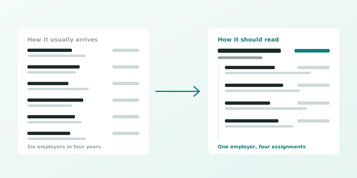
A parser turns your document back into structured fields: employer, title, dates, skills. To do that it has to decide what order the text is in. A single column has one possible answer. A two-column layout has two, and the parser picks based on how the file was constructed rather than on how it looks to you.
| Single column | Two column | |
|---|---|---|
| Reading order | One, unambiguous | Depends on the parser and how the file was built |
| Typical failure | None specific to the layout | Sidebar content interleaved into the work history |
| Space efficiency | Lower — more pages for the same content | Higher, which is why they exist |
| Where it helps | Large employers running their own system, agency portals, anywhere you cannot see the stack | Design-adjacent roles, short histories, human-first channels like a direct email or a portfolio |
| Recovering from a mis-parse | Nothing to recover from | You will not be told it happened |
Keywords ATS looks for
Weave these into your CV where they’re true to your experience, and always mirror the exact wording from the specific job post you’re applying to.
Common mistakes to avoid
Best ATS Resume Template CV: FAQ
What is the best resume template for an ATS?
A plain single-column layout with standard section headings and real selectable text. No tables, no sidebar, no graphics. Every extra design decision is another thing a parser can get wrong, and none of them earn you anything with the recruiter reading it afterwards.
Why does a single-column template parse better?
Applicant tracking systems read top to bottom, left to right. Multi-column layouts, sidebars, tables and text boxes can be read out of order or dropped entirely, which is how people end up with their job titles detached from their employers. A single column guarantees the sequence.
Who should use this template?
Anyone who wants the safest option: engineers, students and freshers, finance and business professionals, career-changers. The structure is neutral enough to suit nearly any role, which is the point of it.
How much does it cost?
Building and previewing cost nothing. You can write the whole resume in this template, watch the ATS score and see exactly what you would be downloading before paying. The PDF download needs a plan, from a one-time $4.99 for seven days, which does not renew.
How do I build this resume?
Pick the template, fill in each section, and watch the live ATS score as you write. It flags missing keywords against a job posting you paste in, and exports a selectable-text PDF when you are done.
What is a single column resume?
One where every block runs the full width of the page, top to bottom, in the order you want it read: contact details, then summary, then experience, then education, then skills. Nothing sits beside anything else. A two-column resume puts a narrow sidebar down one side, usually holding skills, contact details or a rating chart, with the main history beside it.
Is a single column resume better?
For getting parsed accurately, yes, and that is the only claim worth making. A single column has exactly one reading order, so there is no way for a parser to interleave a sidebar into your job history. It is not automatically better looking, and a recruiter reading it by eye may not notice the difference at all. The advantage is that nothing can go wrong before a human sees it.
Do two-column resume templates fail an ATS?
Not usually, and we would rather say that than sell you a scare. Our gallery includes two-column templates and every card says which is which; they pass four of the five layout checks. The one they can miss is reading order: an older parser can take a sidebar before the column next to it, which is how a skills list ends up wedged between two employers. If the employer is large enough to run its own system and you cannot tell what it uses, the single column removes the question.
What is the best single column resume format?
Reverse-chronological, with standard headings a parser recognises — Summary, Experience, Education, Skills — dates on the same line as the employer, and real selectable text rather than a picture of text. That combination is what this template is. The format matters less than not breaking any of those four rules.